Roundup of Favorites, 004: I've Been Into Metallics Lately

In April I marveled at the quantities of gold-hued business cards available in the Zazzle marketplace and shared some fun examples in this blog post.

Recently, without really thinking about that long-ago discovery, I've once-again been enjoying the process of working with faux metallic textures. Particularly where little packs of cards are concerned. Turns out I like them rather a lot. Today I thought I'd share some links here to a few of the recent favorite designs I've posted in my Paper Muserie Zazzle store. And the other thing they have in common? They're all printed on little cards typically distributed as business cards but, as we know from when I shared this post, this is fortunately a typical practice but certainly not a rule! Thank goodness. There are enough rules running around keeping people in order, without mandating that Business Cards Must Be For Business! Of course some of these ARE for business. But take a look at how many options are available just in this small selection:

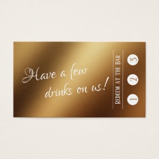
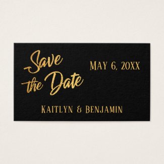
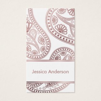
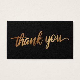
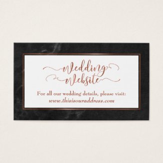
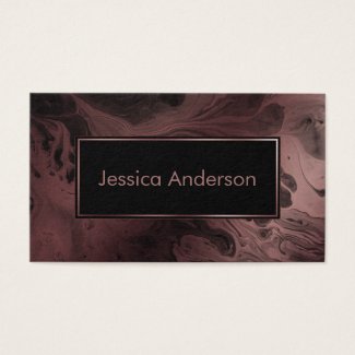
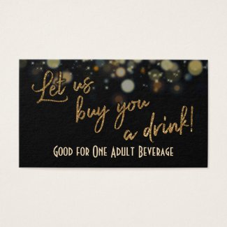
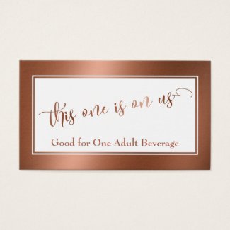
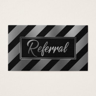
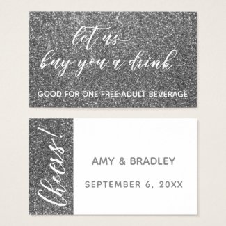
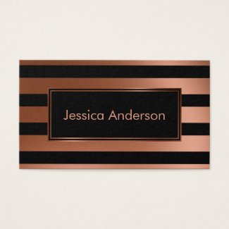
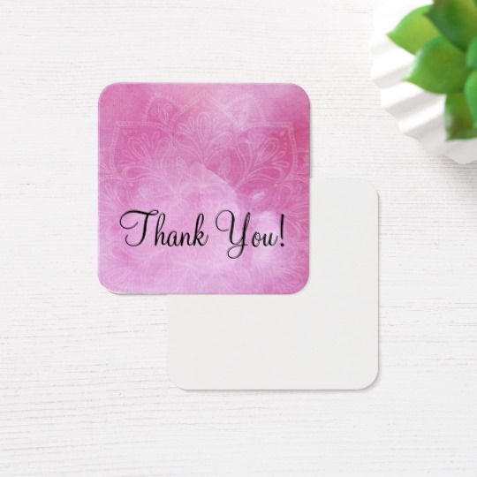
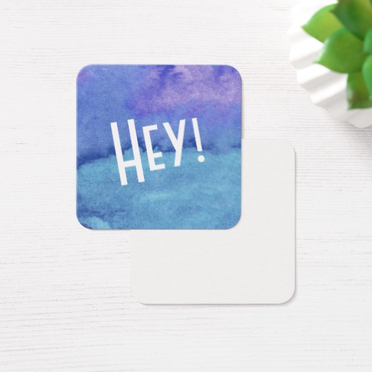
As you see, the "lowly business card" is truly quite versatile! I've created the above with a variety of intentions. Pictured here are actual business cards for traditional use, drink tickets for parties and wedding receptions, and Save the Date card inserts, for folks who prefer a little handout to the larger, more traditional option. You also see wedding website detail card enclosures and little thank you gift tags.

On any given day, one of the metallic treatments I've used above is my favorite. Of course four bases are covered: gold, silver, rose gold and copper. I love combining a smooth faux copper foil effect with black marble as you see in the wedding website on the last row. It's also fun to add a glitter effect, such as you see both in the background of the silver drink ticket on the second row and in text, as I've used in the gold glitter-enhanced one beside it. The Save the Date card on the left of the bottom row has a more textured, traditional gold foil leaf effect and there's plenty of texture in those letters.

I'd be remiss if I didn't mention the rose gold-enhanced faux marbling I added to the texture seen in the background of the third business card on the top row. Marble surfaces are very trendy and I thought it would be fun to see what resulted if I added color like this to one of those marbled textures that looks more liquid than stone. Here's just one of the results. More are in the store and still others are on their way!

Whatever your need, if you're into metallic surfaces and like to have handy little business, enclosure or gift cards to hand out as you go your way, these are definitely worth your consideration. I can't wait to see what comes from my next design sessions when I get to work with metallic surfaces again!

For those who are truly curious, here's a direct link to all the business card-based designs in my Paper Muserie store right now.

Roundup of Favorites 003: Really Digging these Products Today - My Designs

In keeping with the growing tradition of showing what I'm in love with on a random day in this blog, I really dig these designs today. Maybe you'll like them too! You can click the images of the photos to be taken to the shop where they're available for purchase. Lower in the page I've written little blurbs about each; you'll find links there too.

A Few Notes About the Merchandise in this Group

  1. This postcard features a digital art design I created on the fly a few nights ago. The worst part is that I made a really novice mistake and wrote over the file with another design. So I don't have the original artwork on my computer. I can design hundreds - maybe thousands - of different products with this design using Zazzle, but right now, not through anyone else. Why does that bother me so much? a) Mild OCD tendencies, b) I really want this design on a kimono wrap from Art of Where. One day I'm sure I'll cave and see what Zazzle can do to help me get my hands on the high resolution version of the art. For now, I'll just buy some postcards like these to keep it fresh in my mind.
  2. A mug with the same artwork as the postcard. I have several of my designs printed on mugs but don't think I won't eventually cave and get this one, too. Because pretty!
  3. Maybe you have some friends turning 50 soon? This coozie is a fun gift or party favor for the Fifty & Fabulous party!
  4. Last year my honey bought me a sweet little Wacom tablet to try out and see what I could do. This postage stamp is printed with the results of one of the earlier things I did with it. All the circles make me happy. I always think what if river rocks and constellations had a baby.
  5. Another of the tiny, square notes I design on business cards, this one says Thank You on the front. It features a rich pink watercolor background with a subtle, organic mandala over it. I wrote more about a set of these over here.
  6. Somehow this specific design of leggings - out of something like 69 pairs in my Zazzle store alone - became one of two that ended up on the right radar. I've sold 3 pairs of this one. In fact it's one of two different pairs that keeps showing up in my list of royalties. Fun and whimsical and simple. Thank you to those buyers!
  7. Another of the friendly cards for leaving notes. This one has a purple and blue abstract watercolor background.
  8. I kept running into merchandise that said "I am silently correcting your grammar" and one day after a friend who is also a client and I had talked and I'd explained something to her having to do with an improved way to word something on her forthcoming blog post, I realized the original phrase really bugged me. I added the thought of morning snark without coffee and came up with this: "I am not silently correcting your grammar. I just need more coffee and then I'll explain how you need to fix it." The phrase and the design printed on this mug, specifically, made me much happier than the original and my clientfriend who happens to have dyslexia agreed with me. The first sentiment isn't at all friendly, but this one works brilliantly! Yay English majors!

Roundup of Favorites 002: Feeling Pretty Pleased with These Designs

One of the reasons I'm glad I started this roundup segment is that it's easy for products in my stores to fall through the cracks. My pace isn't always rapid, but there are times when I get into a groove and post quite a lot of designs. And by "quite a lot" I mean an obsessive amount that blows my own mind at times.

Having a "column" like this will help me highlight items I've designed that might not be seen so quickly or readily. It's not just about my design pace. Since I have a few thousand items available already, before I even launch this website, this new feature also gives me the chance to dig into areas that may be buried in my store in lieu of other designs people have somehow found without my actually marketing them. 

I created a collection to gather all these in one place, if you wanted to see them in one place in my store. You could see that by clicking any of the images on the right. Otherwise you can just click the direct links provided in the little gallery below to be directed to the item's unique page on my Zazzle store.

Just like the other "Roundup of Favorites" items I'm starting to add to this blog's offerings, I haven't yet thought it necessary to make sure these items go together in any real way. They're intentionally mismatched, so as to appeal to a broader taste in style and design. Not to mention, you may never think of buying a personalized mug but have always wanted a more unique design for your home collection of coozies than those that promote beach surf shops and your local phone company. Voila! I included one of those just for you! And more...

Like Words Better Than Pictures? Read a Smidge About The Items in This Collection:

  • Personalized mugs can be fun to use AND gift. Adding mismatched, retro patterns to the mix like you see on this one makes this mug design even more unique. Simple but distinctive.
  • There's a series of items in my Zazzle store that features a set of complementary designs that all started with a fun color palette of red, hot pink, green, yellow and orange. This phone case still makes me happy though I designed it fairly early on when I was learning about Zazzle. You could add your name or initial to really make this case your own!
  • The black-on-white friendly pattern of graphic sunburst-thingie designs is a wine tote. Great for protecting your wine when you take a bottle to a gathering or event. Also an excellent gift!
  • The colorful doodled-can cooler/coozie is just fun. I have this design printed on a tote bag and always get fun remarks when I carry it. You would definitely never lose your drink if you used this drink holder at a party.
  • I had a lot of fun positioning the funky little black and white pattern design on the template for this wall clock. If you're looking for a unique wall clock, check this one out!
  • Geometric, abstract leggings with teal, blue, green and aqua with floral patterns. Designing leggings is mildly addictive and this pair makes me happy. (There are lots of other items in my store that feature this design, too, so check those out if you're inclined.)
  • It boggles the mind to consider just how many possible ways there are to design your business card. If you like clean and simple and you also like black and white patterns, this may be the business card design for you. OR you can replace the pattern with an image you prefer.
  • Your keys will stand out on a hook when you have this abstract, grungy art design on your keyring. Red, teal, gold, black, brown with many textures. This is one of the first designs I ever created when I fell down the Print on Demand Rabbit Hole. You could even get this design printed on leggings through my Art of Where shop if you wanted. Just click here to take a look!

Roundup of Favorites 001: A Random Smattering of My Designs that I Love Right Now

One of the ways I've decided to promote my print on demand designs with this new site is to start a thread of posts that features some of my favorite designs. A Roundup of Favorites, if you will. This set features my own designs. Down the line, I suspect other roundups will include designs of others. But I designed these and I'm pulling from a fairly recent set of things that please me. (Nearly everything is my favorite when I push that "publish" button, so this series shouldn't be any trouble to flesh out.)
So. The Favorites, Already?

Here they are. Things I kinda dig today and if I had a need to buy a custom gift for you or someone else just as cool as you are, these are the things I would consider putting on my shopping list! Yay you and that other cool person on my shopping list!

A Bit About the Items in This List

  1. This grungy, messy, abstract artsy luggage tag can be updated with your own name.
  2. This black phone case has 3 circular designs that can be positioned wherever you like, and you can add your name instead of the place holder text.
  3. Quirky black and white leggings.
  4. The pair beside the first ones features the same pattern, with an added bonus. It has a black ombre/gradient image over the top that fades away to reveal the pattern below. You can re-position the overlay to reveal or hide as much as you like.
  5. Also for your workouts, this shirt has a graphic on the front and back that reads "commence with the badassery" which is a phrase that first occurred to me years ago when I was designing a card for a friend about to run the Boston Marathon. Because Boston Marathon: Utter Badassery. But you don't have to run marathons to be worthy of this shirt. (Or all the other styles and colors you could order, printed with this same design.)
  6. I like to surround myself with inspiring, positive messages. I also find that having something to read nearby that reminds me to get up and move around, to drink more water, to pull out my yoga mat - all manner of things - will help me remember to do it! So I designed this mouse pad with the option of adding your own motivating words and phrases. It appears over one of my messy, bold, bright graphic images but you can add your own if you'd like something a bit calmer. :)
  7. This water bottle is printed with a different black and white pattern. This time, just different sizes of black wheels with spokes. Kinda quirky. I do love some black and white patterns. More on that over here.
  8. Similar to the artwork seen on the leggings, and from the same series. These are the cutest tiny little speakers. They're printed front and back with our artwork. For this one, I rotated the design a bit for added visual appeal.