When I had been at this print on demand thing for a few months, had even taken an online course to make sure I was working as efficiently with the Zazzle system as I could (for a beginning "Zazzler" as my young nephew now calls me, that is) I realized I really wanted to tiptoe into the wedding invitation design waters. Knowing that we're no longer limited to the uber-formal, engraved, traditional, must-be-done-the-way-the-garden-club-members-say-it-must-be-done invitations that were once the norm, I warmed to the idea. What sent me further down the road with confidence was the realization that my designs are not going to mess up anybody's wedding. (Way less pressure than wedding photography, this!) I mean, if a bride likes my design, she is welcome to buy something I've offered. But no pressure. I can just put it into the pot of all the other thousands of other designs (no competition pressure there, lemme tell ya!) and people are free to choose or walk away.
And so I decided to go with something fairly simple and subtle and take it from there.
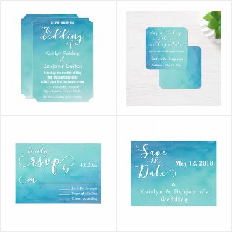
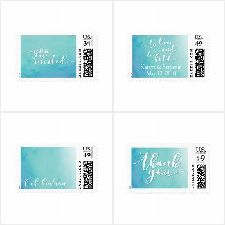
I took the leap and I jumped with a soft teal and blue ombre design that features one of the sweet, modern script fonts from my obsessively growing collection for key phrases, and a watercolor background. The biggest sale Zazzle has made thus-far with one of my designs (read: most numerous parts in one order) were a set of 85 thank you cards from this set. Elated, that was me. I keep thinking of ways to arrange and lay out details that can be presented to people interested in this design suite.
For now, though, it's got quite a lot in it and there are definitely things I've learned that I won't do in future sets. Still, it was a fun first step and I'm happy to show it to you now. And document the progress from this early example.
Enjoy!